Basic Color Theory for Photographers
Colors generate emotions and visual hierarchies. The color wheel is your map: complementary colors create tension; analogous ones, harmony.

One dominant color, two secondary colors at most, split 60-30-10. That is the recipe that organizes a photo full of color. The color wheel is the map for choosing them: complementary colors sit at 180° and create tension; analogous ones are neighbors at about 30° and generate calm.
Colors don't just "look pretty": they generate specific emotions and establish hierarchies within the frame. Color temperature communicates on its own: cool colors suggest distance or melancholy, warm ones evoke intimacy and energy.
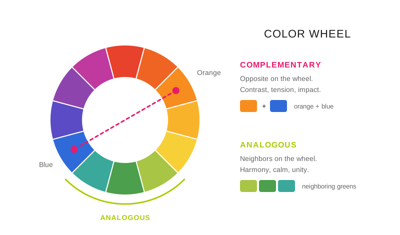
The color wheel: complementary colors face off and analogous ones live together in harmony.
Why do too many colors ruin a photo?
Saturating an image with hues creates confusion and blurs the message. Order the visual hierarchy: define a dominant color and support the narrative with secondary or neutral colors that complement it. That way, each photo gains strength, coherence and an atmosphere of its own. The choice between warm or cool colors, saturated or neutral, determines whether your photo conveys cozy warmth or minimalist distance.
What color scheme do I use in each scene?
Scheme: Complementary; How it's formed on the wheel: Two opposite colors, at 180°; What it conveys: Tension and maximum contrast; Typical scene: Ocean blue against an orange sunset
Scheme: Split complementary; How it's formed on the wheel: One color plus the two neighbors of its opposite; What it conveys: The same tension, less strident; Typical scene: Portrait with a blue background and earthy clothing
Scheme: Analogous; How it's formed on the wheel: Three neighboring colors, at about 30°; What it conveys: Harmony and calm; Typical scene: Greens of a forest, blues of a seascape
Scheme: Triad; How it's formed on the wheel: Three colors at 120° from each other; What it conveys: Lively and balanced; rare in nature; Typical scene: Urban scenes, markets, signage
Scheme: Monochromatic; How it's formed on the wheel: A single hue varying light and saturation; What it conveys: Isolation, minimalism; Typical scene: Colorful subject against a neutral night background
Scheme: Accent on neutrals; How it's formed on the wheel: One strong color plus grays and browns; What it conveys: Undisputed prominence; Typical scene: Sober landscape with a single note of color
The scheme isn't chosen in editing: it's chosen when framing, by deciding what goes in the frame and what stays out. Moving one step to the left to take a red car out of the frame does more for harmony than any slider. How that decision combines with the rest of the composition is in the guide to dynamic visual composition.
Practical application
Complementary scheme: Ocean blue + orange sunset = maximum visual impact.
Analogous harmony: Forest greens = a feeling of peace and nature.
Balanced landscape: A single strong color + neutrals = clear prominence.
Night scene: Colorful subject against a monochromatic background = effective isolation.
What settings enhance color?
For saturated colors: diffused light, avoid hard light that "burns" colors.
Golden hour: naturally enhances reds and oranges; the split between warm and cool over the course of the day is in warm and cool colors in photography.
Cloudy day: pastel colors, especially greens and blues.
White balance: adjust to emphasize or neutralize color casts. Using it as a narrative decision and not as a correction is developed in the creative white balance guide.
Why do my colors compete with each other?
Too many colors competing with no clear hierarchy.
Excessive saturation in post-production (unnatural).
Not considering the background color when choosing wardrobe.
Ignoring how colors interact with each other in the composition.
Professional tips
Harmony trick: look for one dominant color and two secondary at most (the 60-30-10 rule).
For portraits use backgrounds complementary to the eye color (blues with oranges).
In landscapes wait for the light that enhances the place's natural colors.
Frequently asked questions
What is the 60-30-10 rule?
A split of surface area: the dominant color occupies about 60% of the frame, the secondary 30% and the accent 10%. It works because hierarchy is set by quantity, not intensity: two colors at 50% compete even if one is more muted, and an accent at 10% rules over everything else even though it is the smallest.
What are the most commonly used complementary colors in photography?
Blue and orange, for a physical reason before an aesthetic one: skin and warm light fall on the orange side of the wheel, and sky and shadow fall on the blue, so almost any scene with a person outdoors already comes with that pair in place. The other two that work are green and magenta, and yellow and violet.
How do I keep a photo from having too many colors?
With your feet and with framing, before editing: move closer, tighten the shot or change angle until the extra colors fall outside. If you can't take them out, lower their saturation selectively instead of raising the subject's, because raising overall saturation brings the problem back magnified.
Do warm and cool colors work the same in black and white?
No, but their relationship survives translated into shades of gray: two complementary colors of similar luminosity (a red and a green of the same brightness) become the same gray and the photo goes flat. That's why in black and white you work with channel filters in editing, to separate in brightness what hue used to separate.
The 44 cards from Enfogram have the color schemes printed with their proportions, so you can decide the framing before shooting and not at the computer.